Cutie&Co. Brand Identity
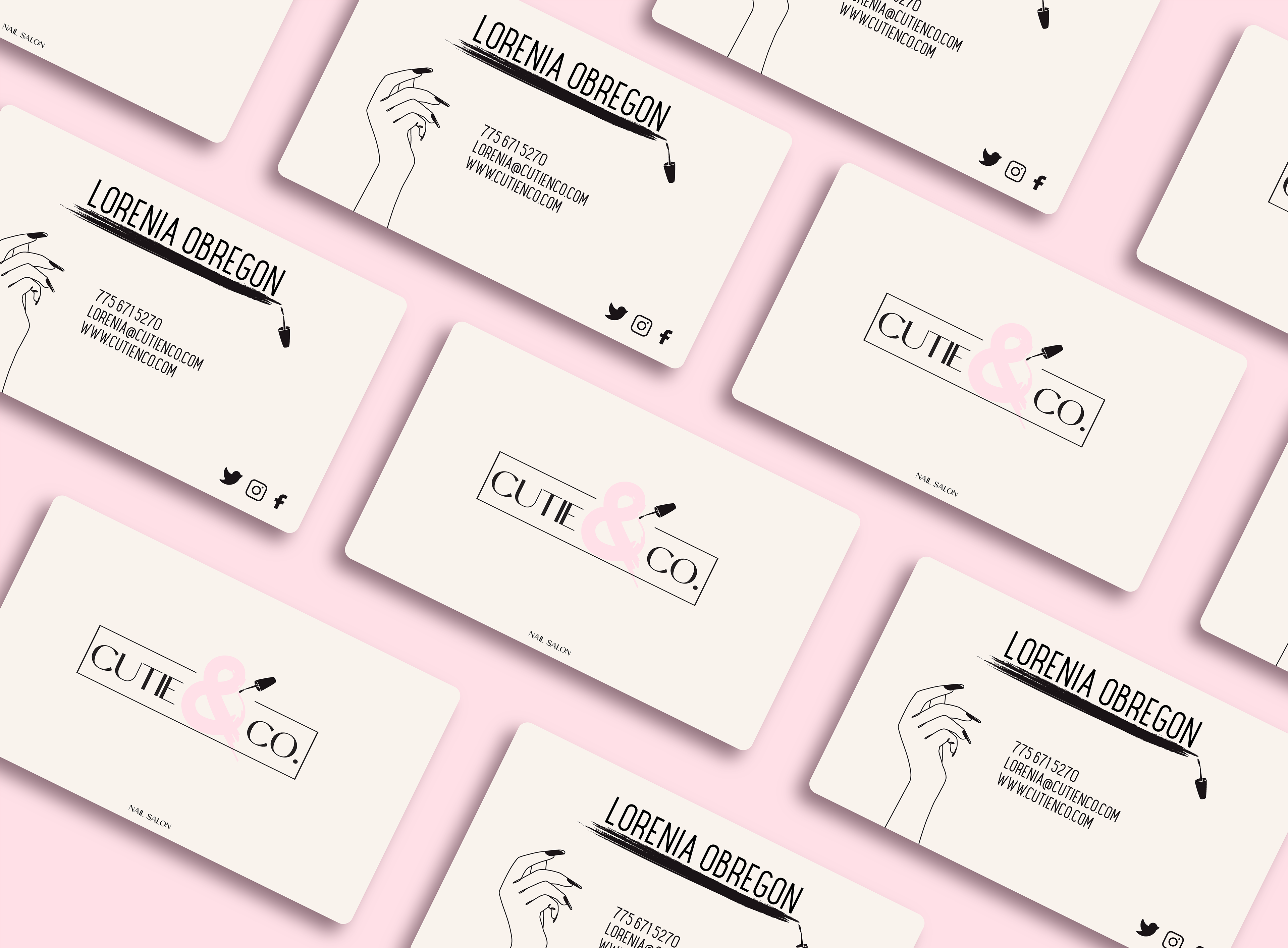
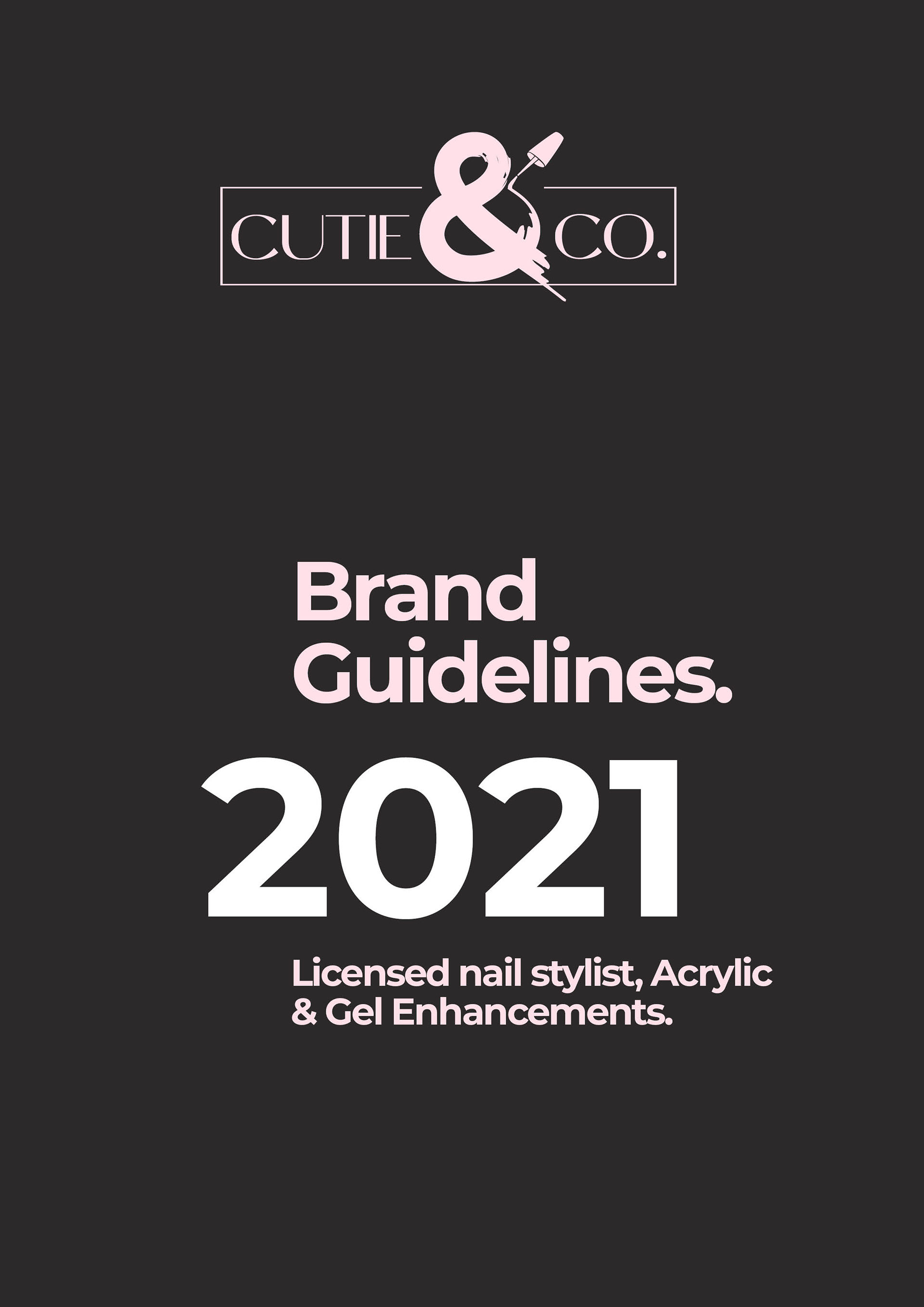
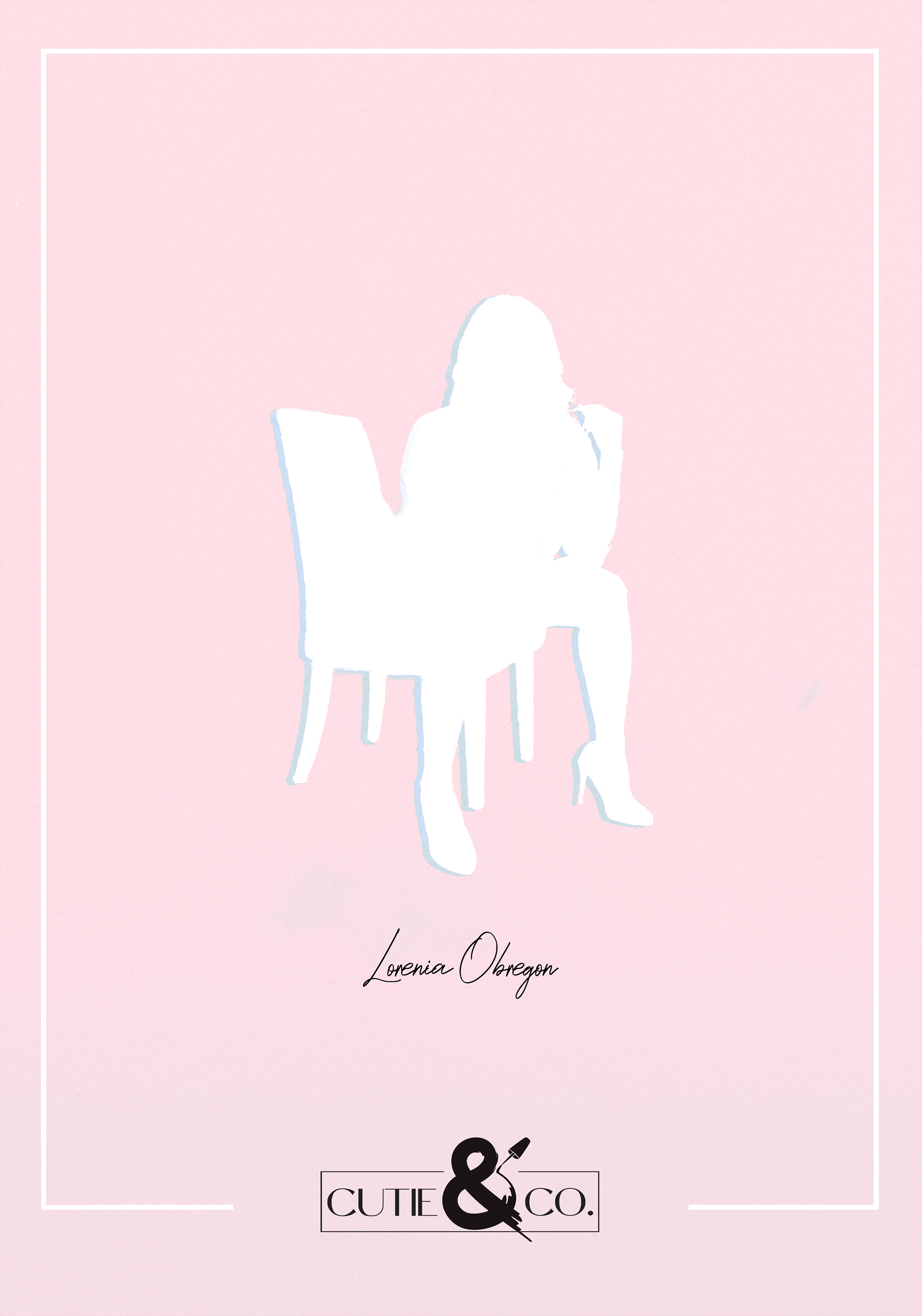
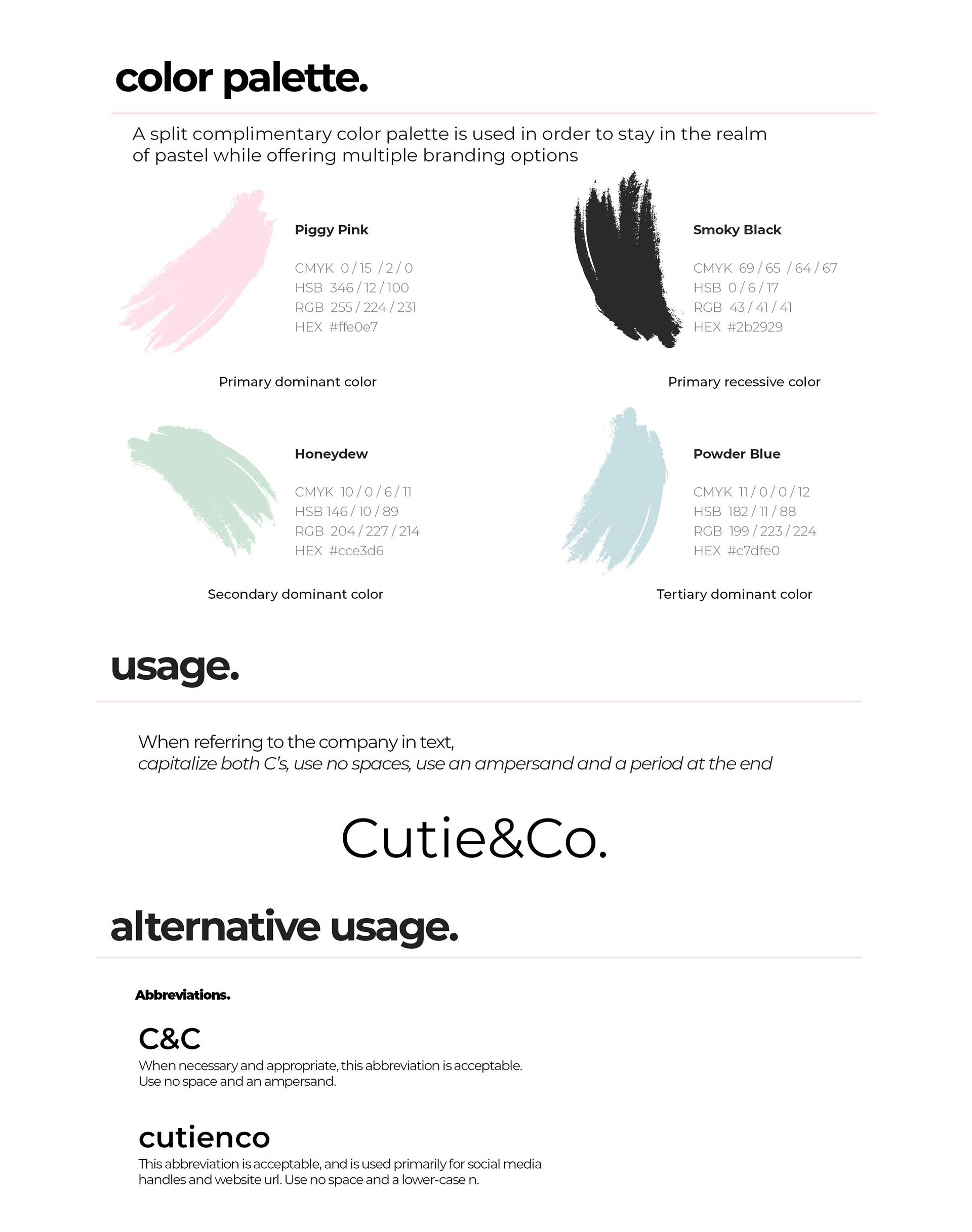
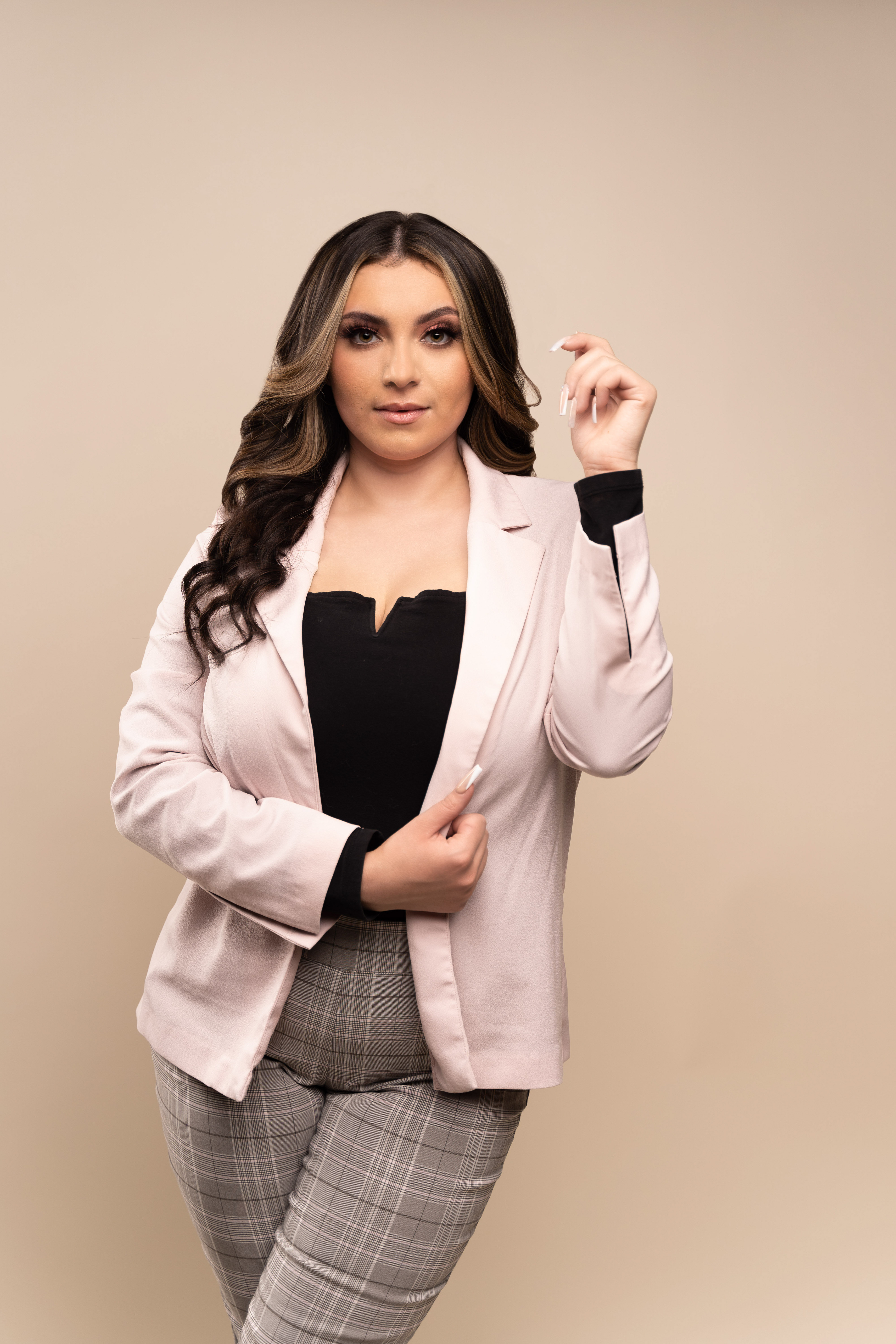
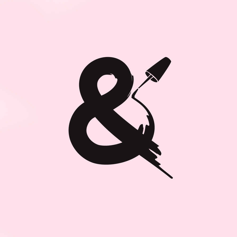
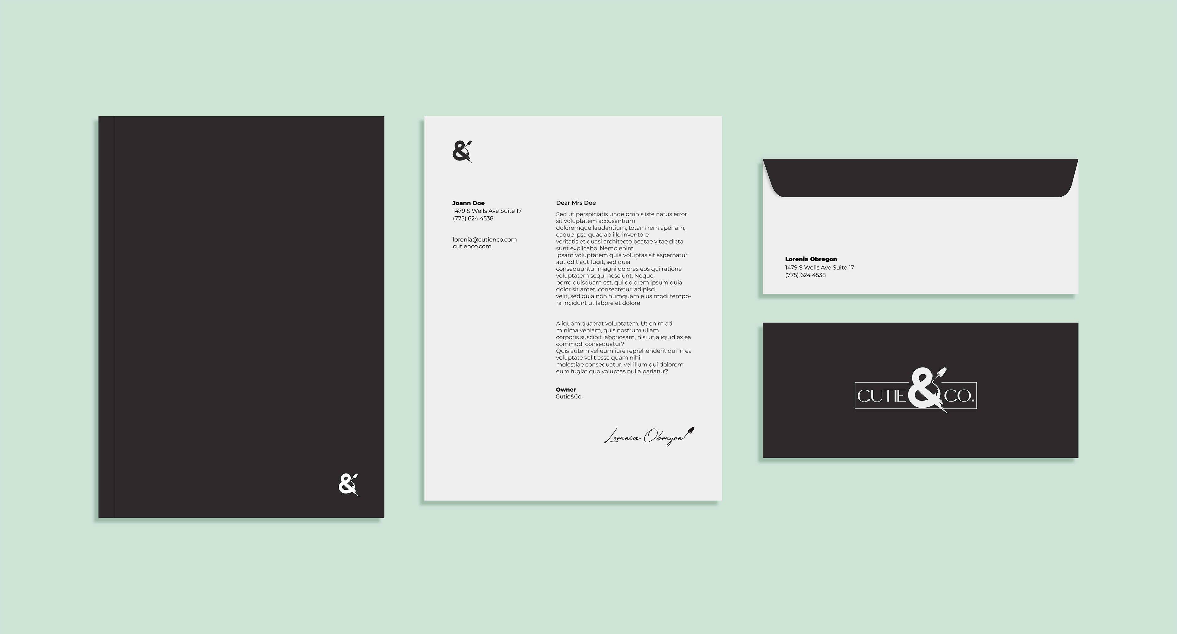
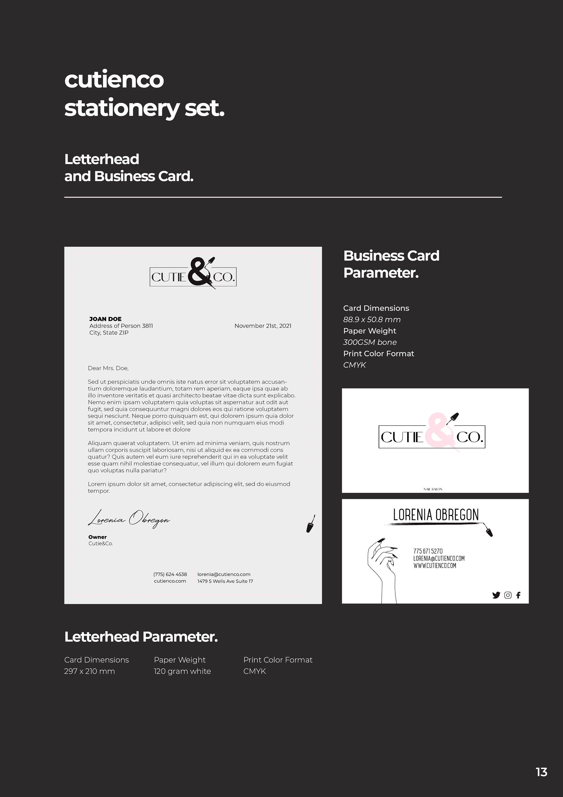
The visual identity for a nail salon with some pizzaz that wanted to stand out from the crowd. The name is a play on words from the term "cuticle".

Crossroads Consulting 360 Brand Identity
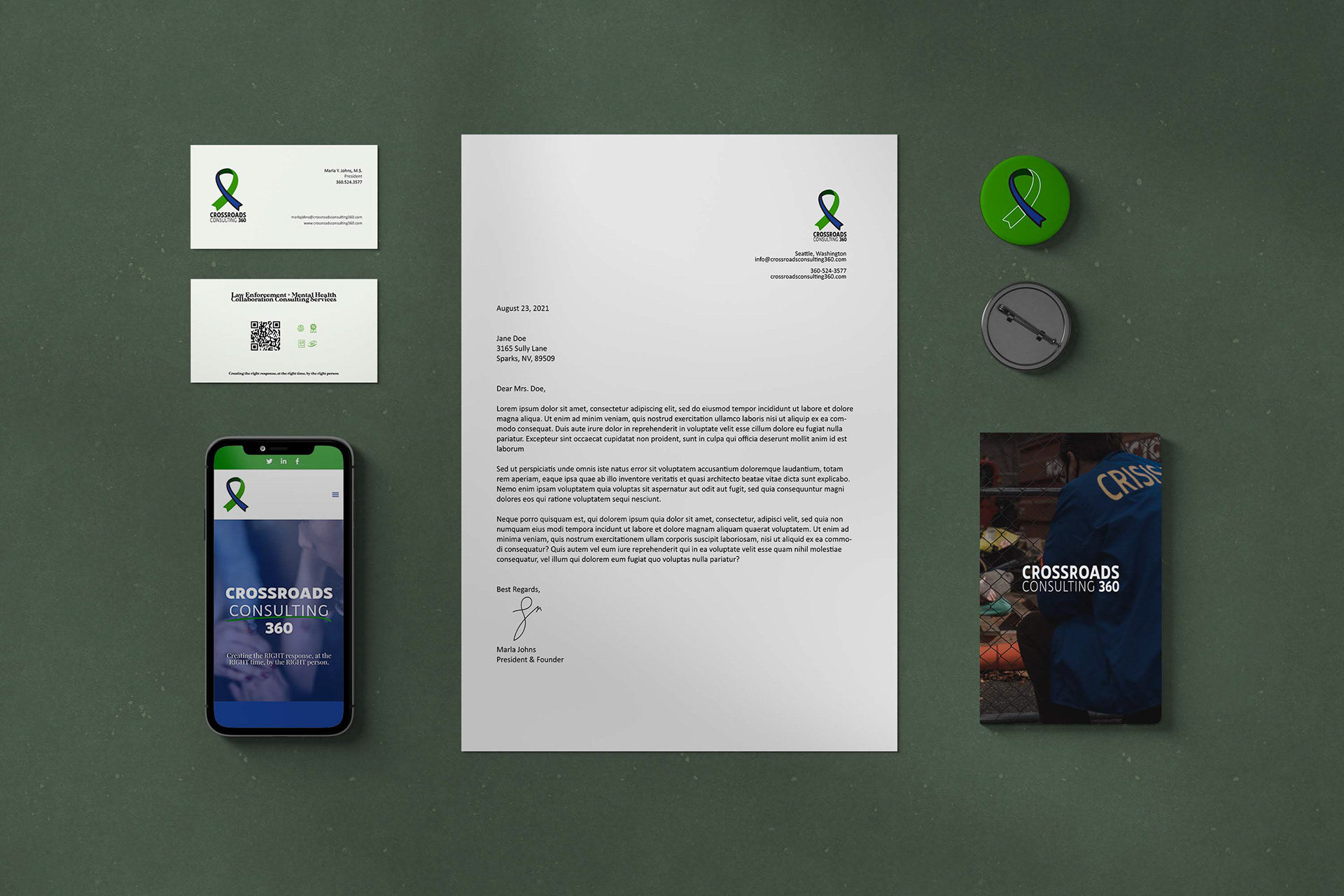
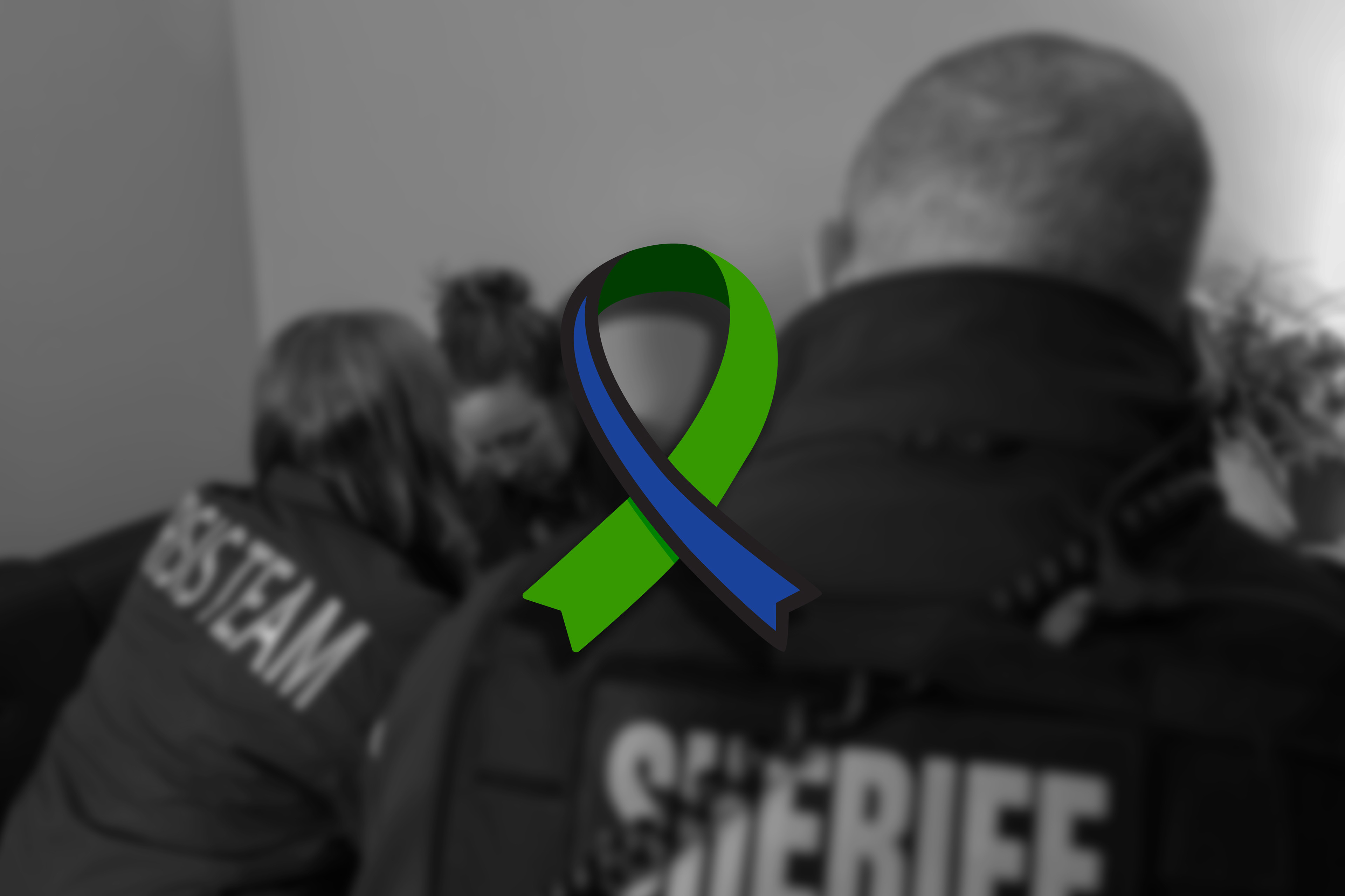
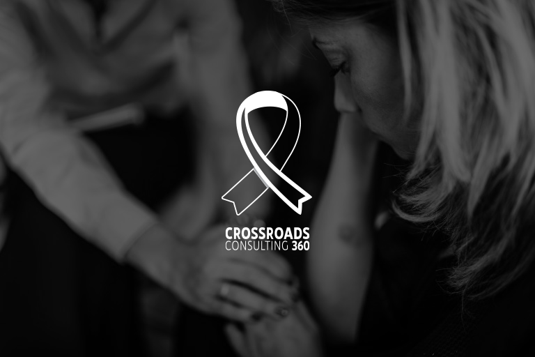
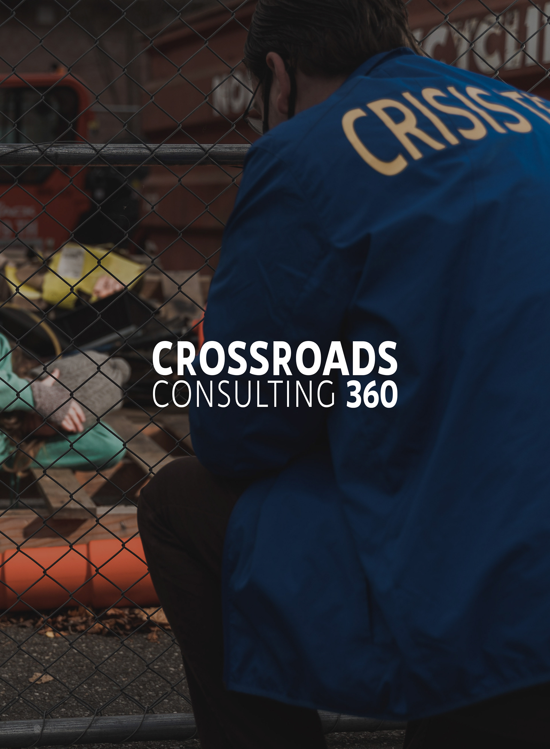
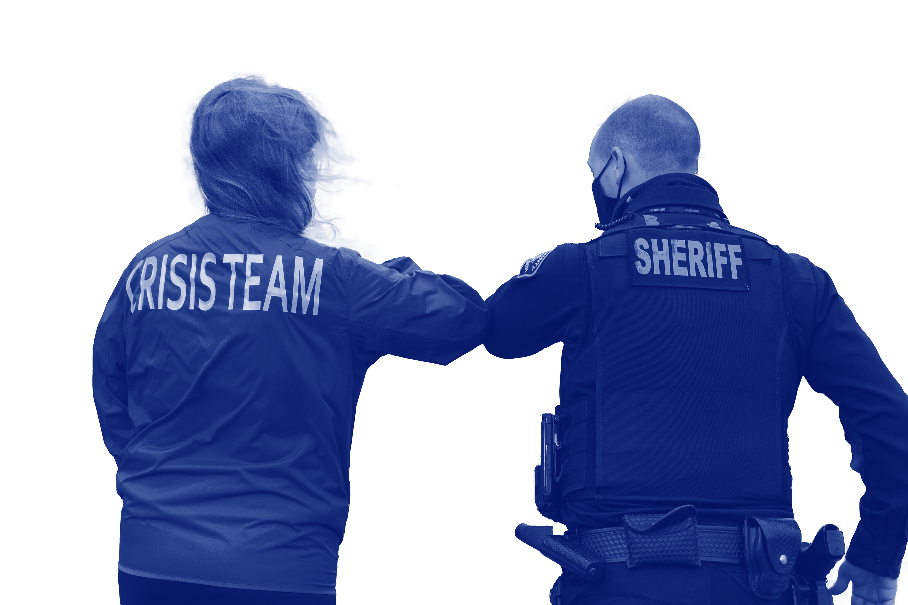
Crossroads Consulting 360 is a company that facilitates the interaction between a police officer and a civilian that may be emotionally or mentally distressed, to avoid further conflict. The brand identity I created incorporates two aspects that she crucially wanted to be included: The Green Mental Health Ribbon and The Blue Line to represent both sides.
Academic Access and Wellness Brand Identity
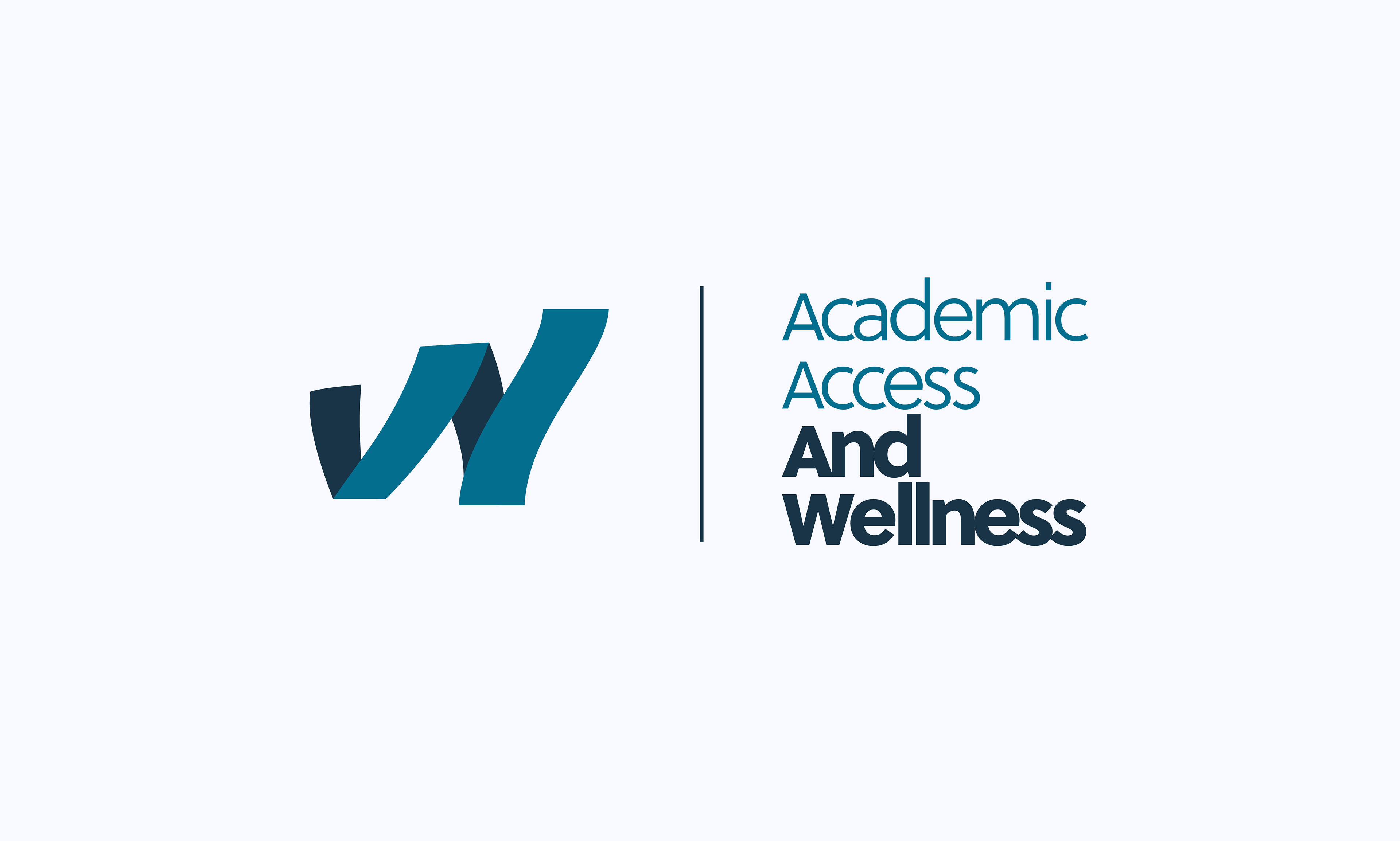
The idea behind the logo relies mostly on a call out to the client's previous logo- where two paths were prominent. The two paths in this instance are actually connected and twirled, to form a W, which encapsulates wellness as a whole.
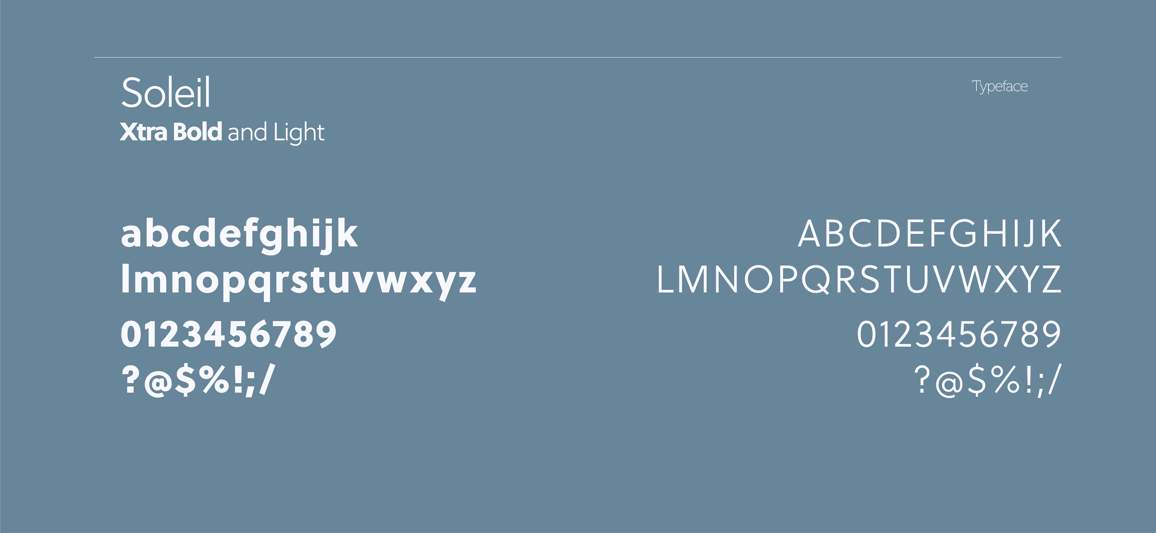
The font choice in the wordmark provides a clean layout of the lengthy company title, where each capital letter is only slightly larger than the lower case letters. The choice behind slightly altering the color is due to wanting to have something that was a bit more punchy.
I feel as though the new tone still feels inviting and comfortable. I played around with the introduction of a secondary color- a darker blue to add more contrast and leeway with brand identity. The overarching brand identity focuses on “paths” through imagery, copy and patterns.



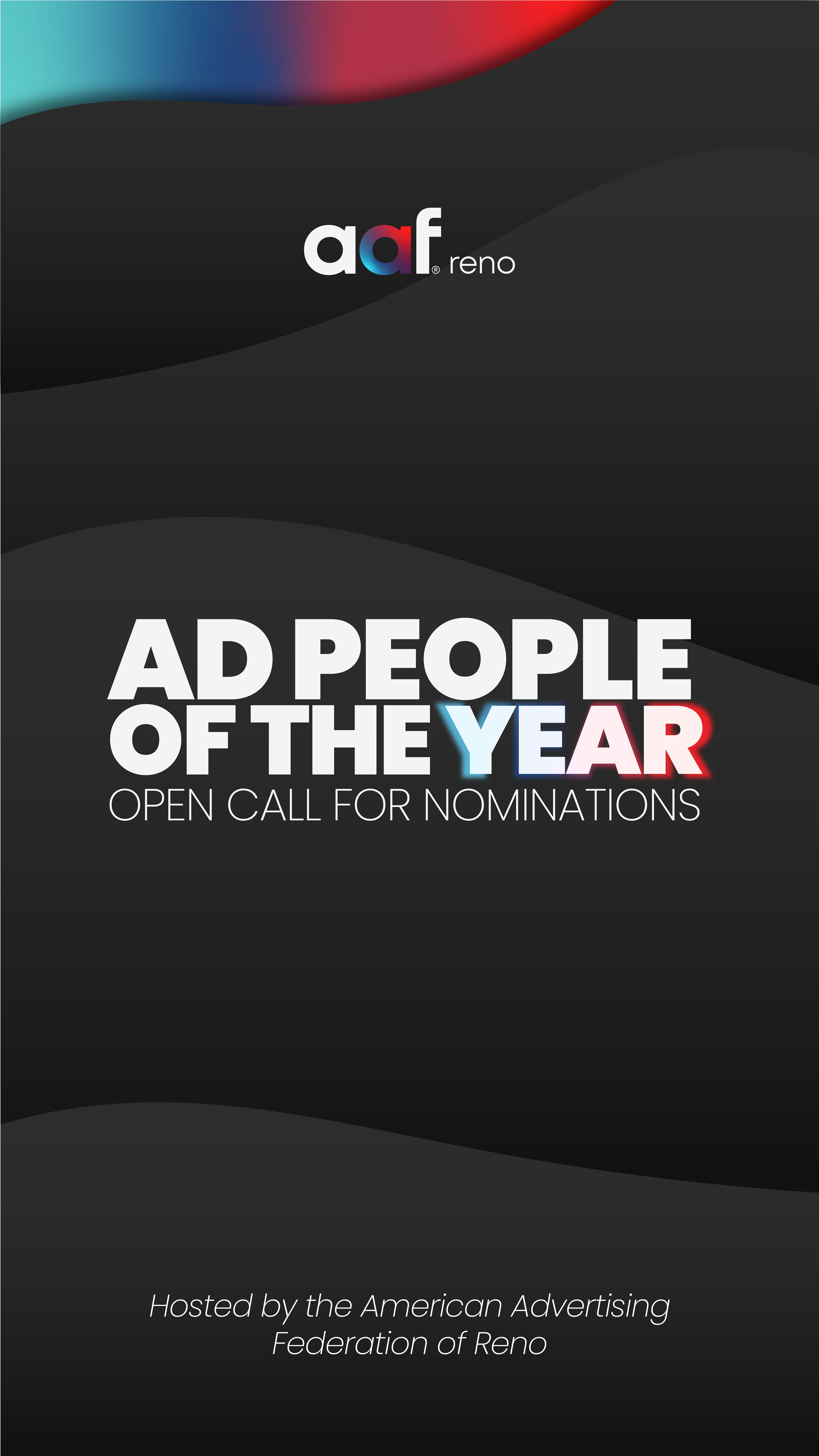
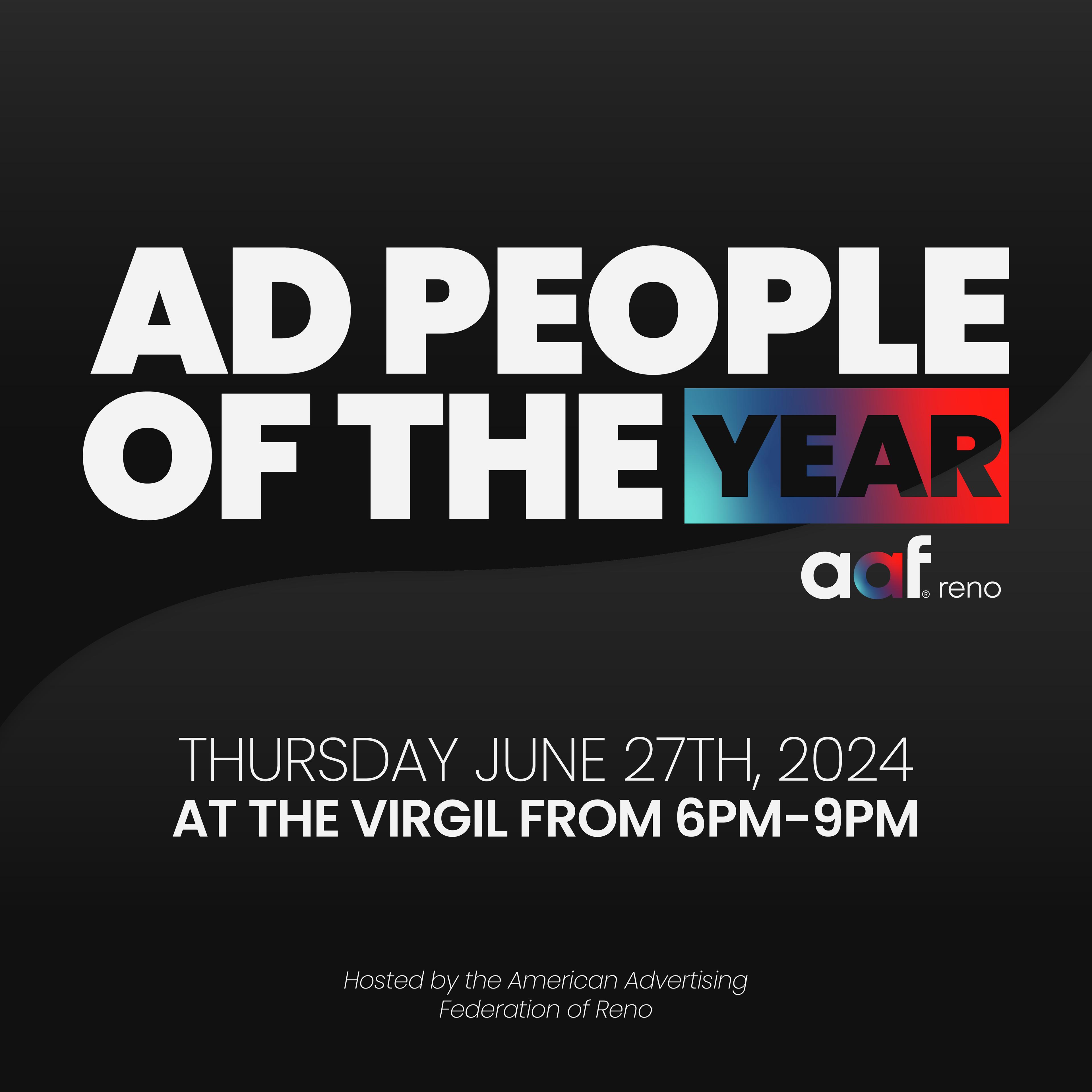
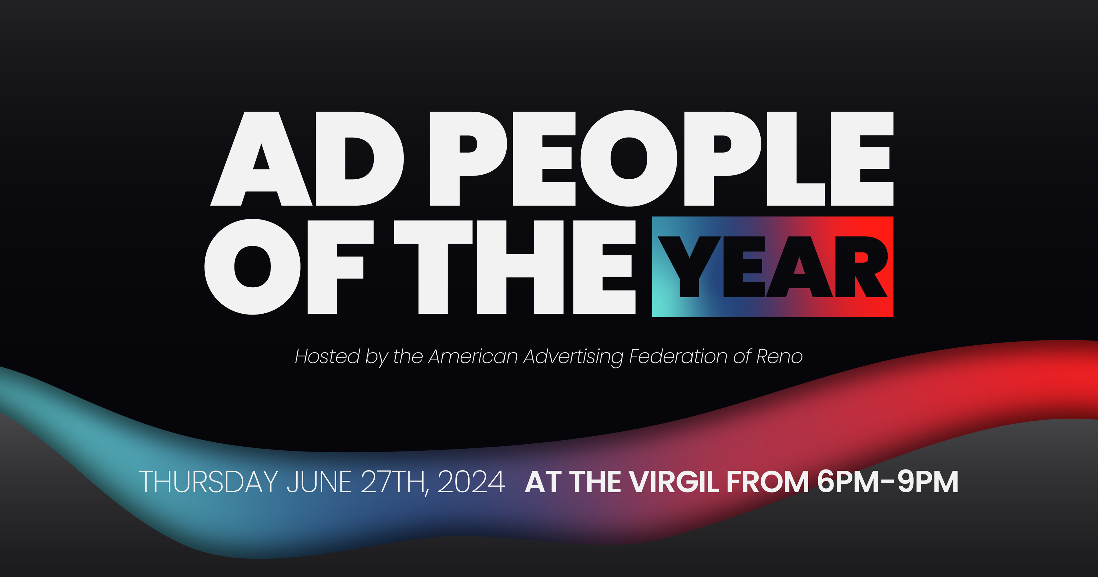
aaf Reno APOTY Collateral & Identity
Identity created for local advertising club, aaf Reno's Ad Person of the Year Event. Social posts, event print collateral and promotional items.
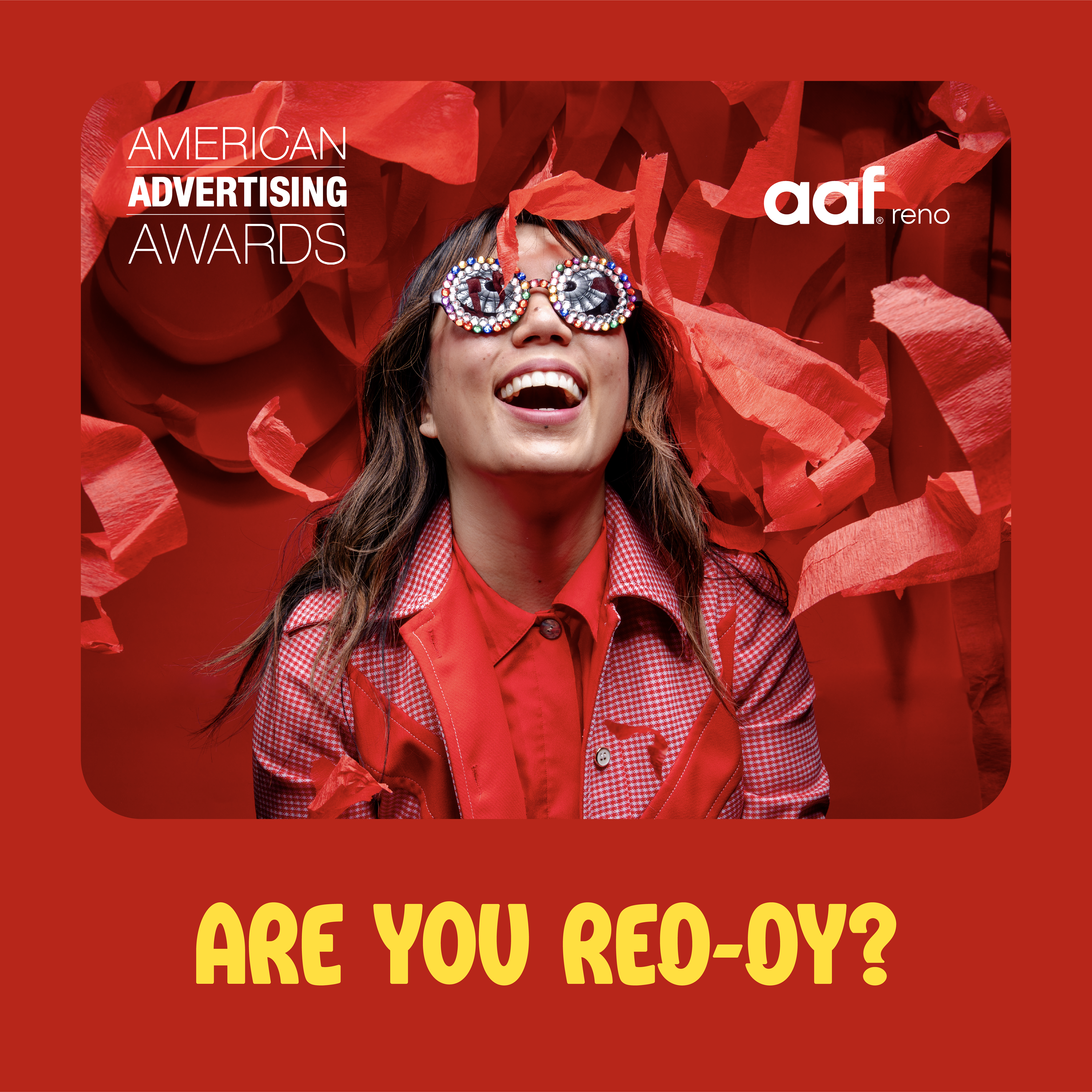
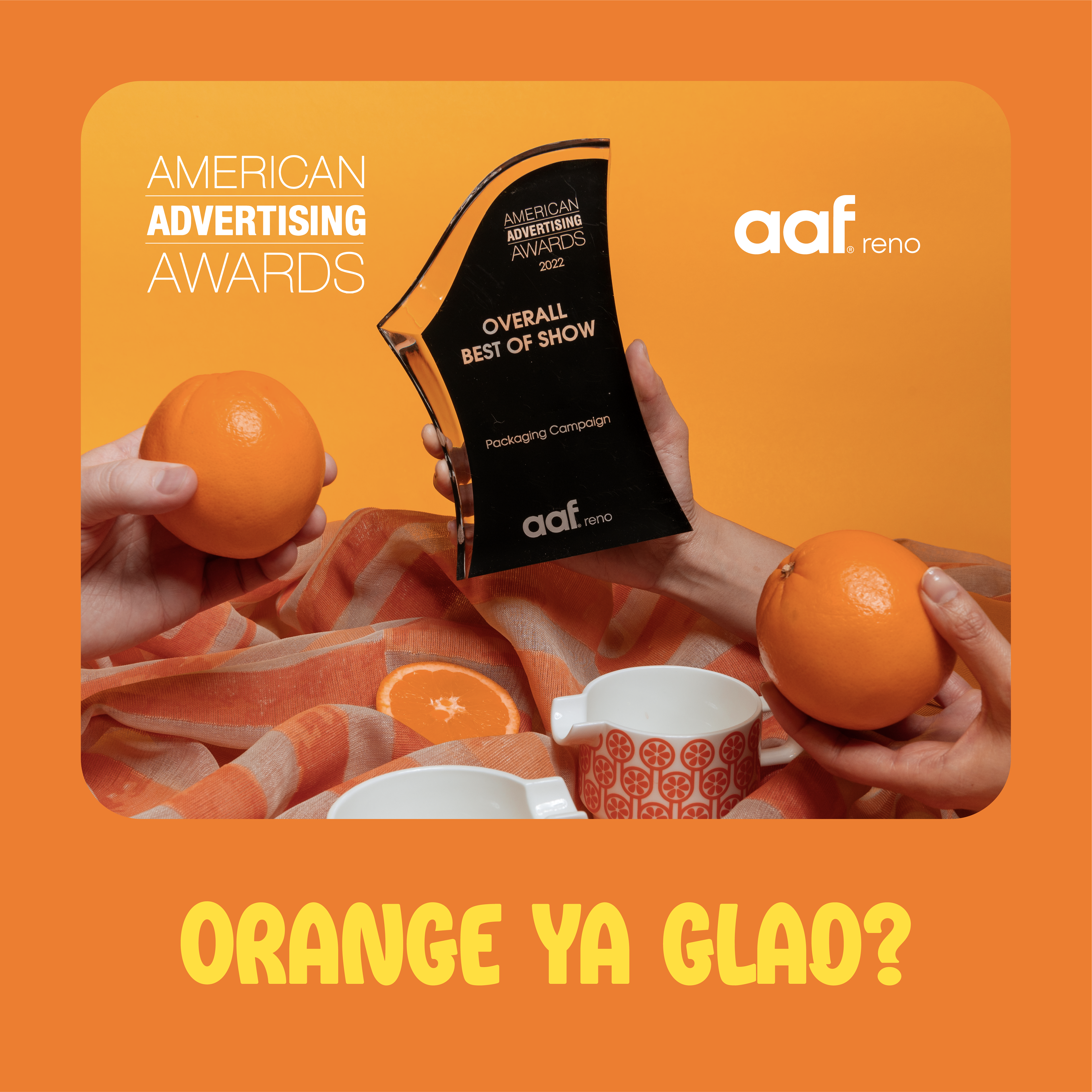
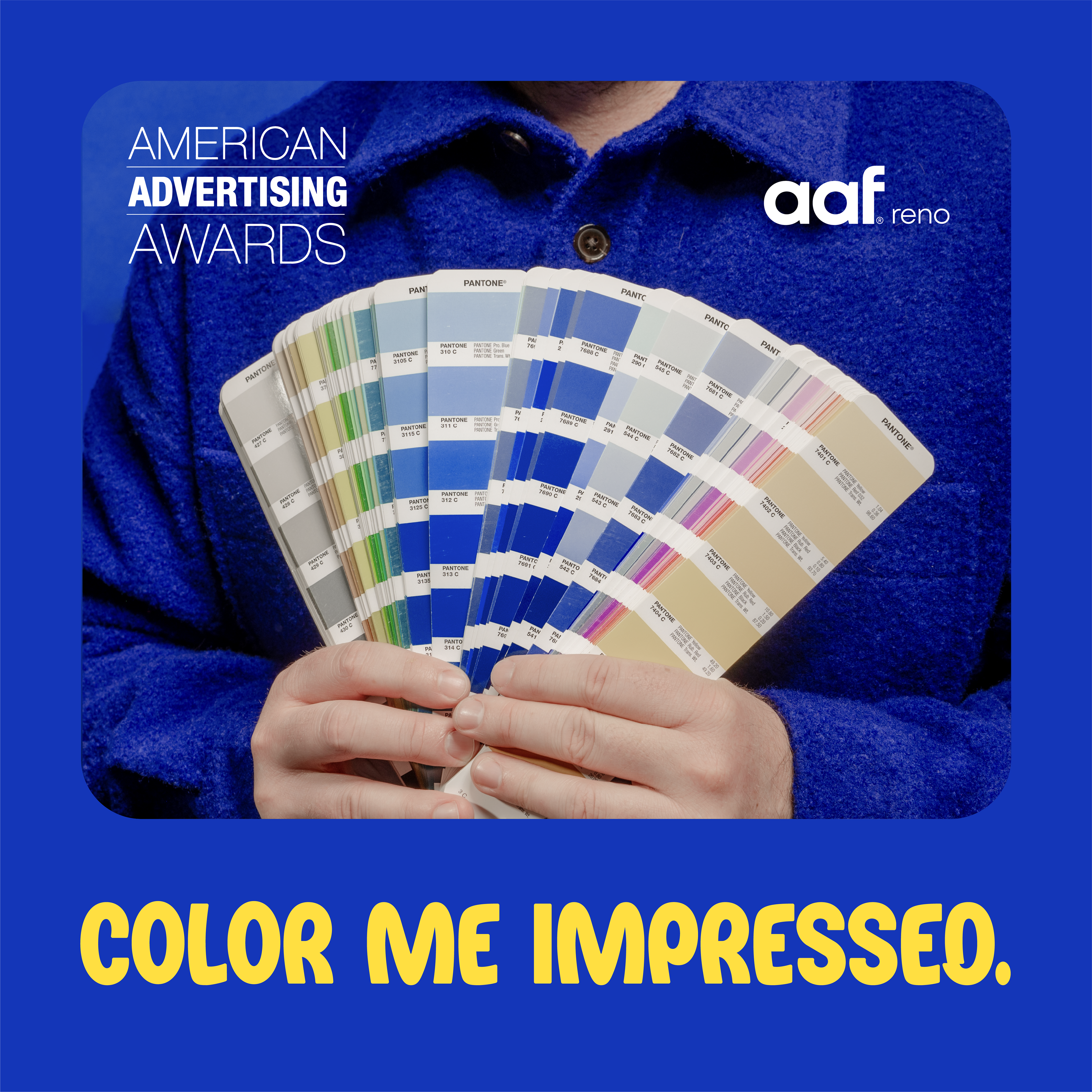
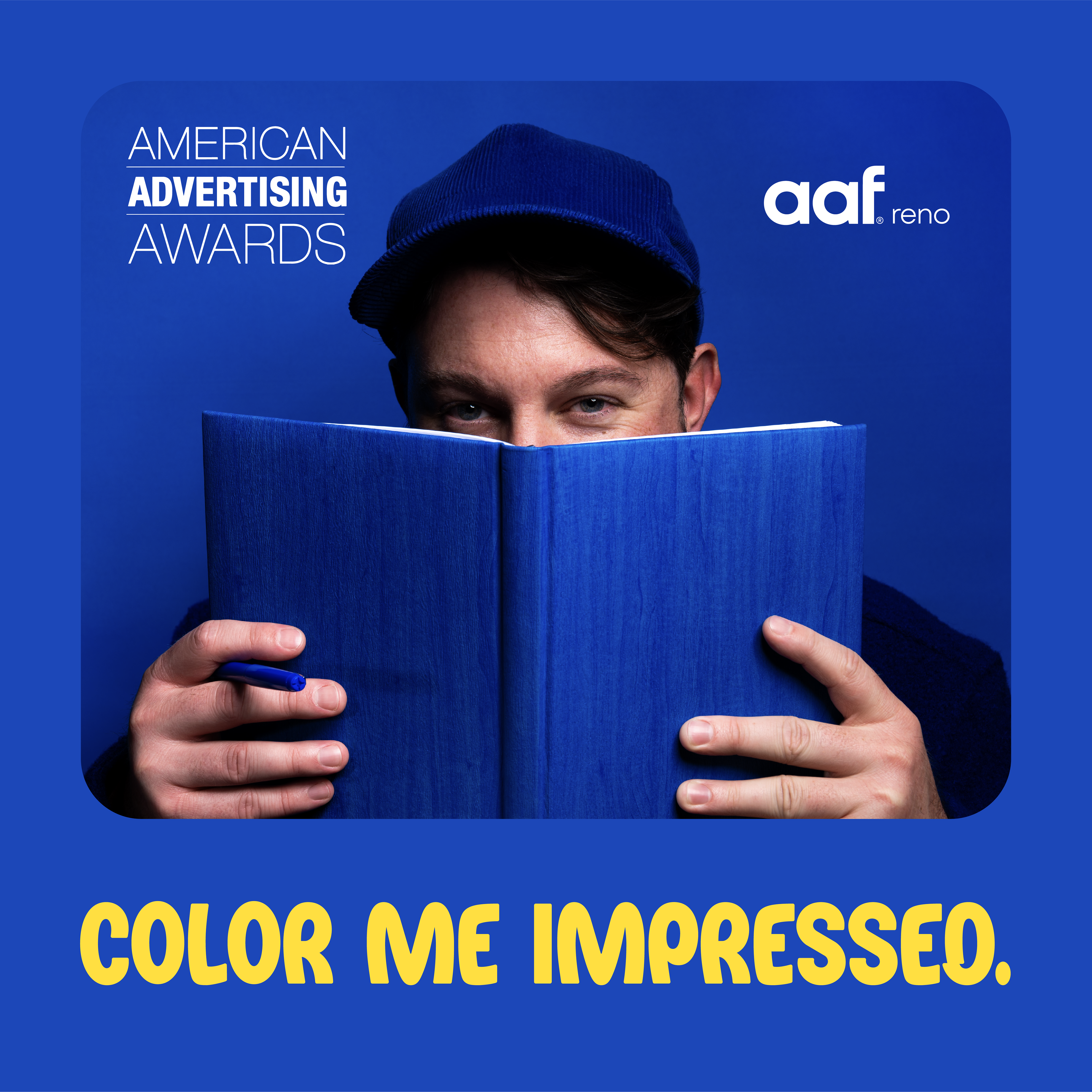
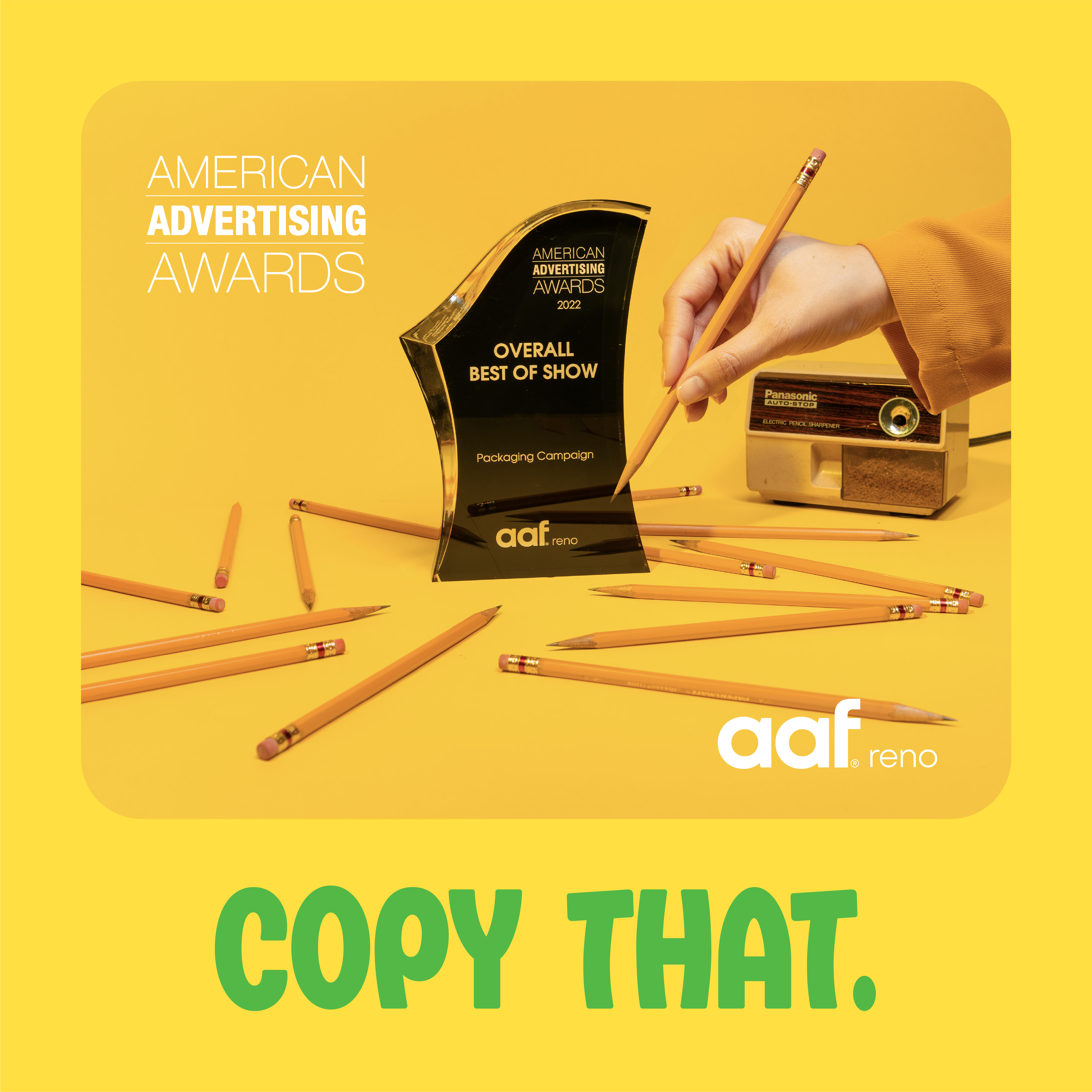
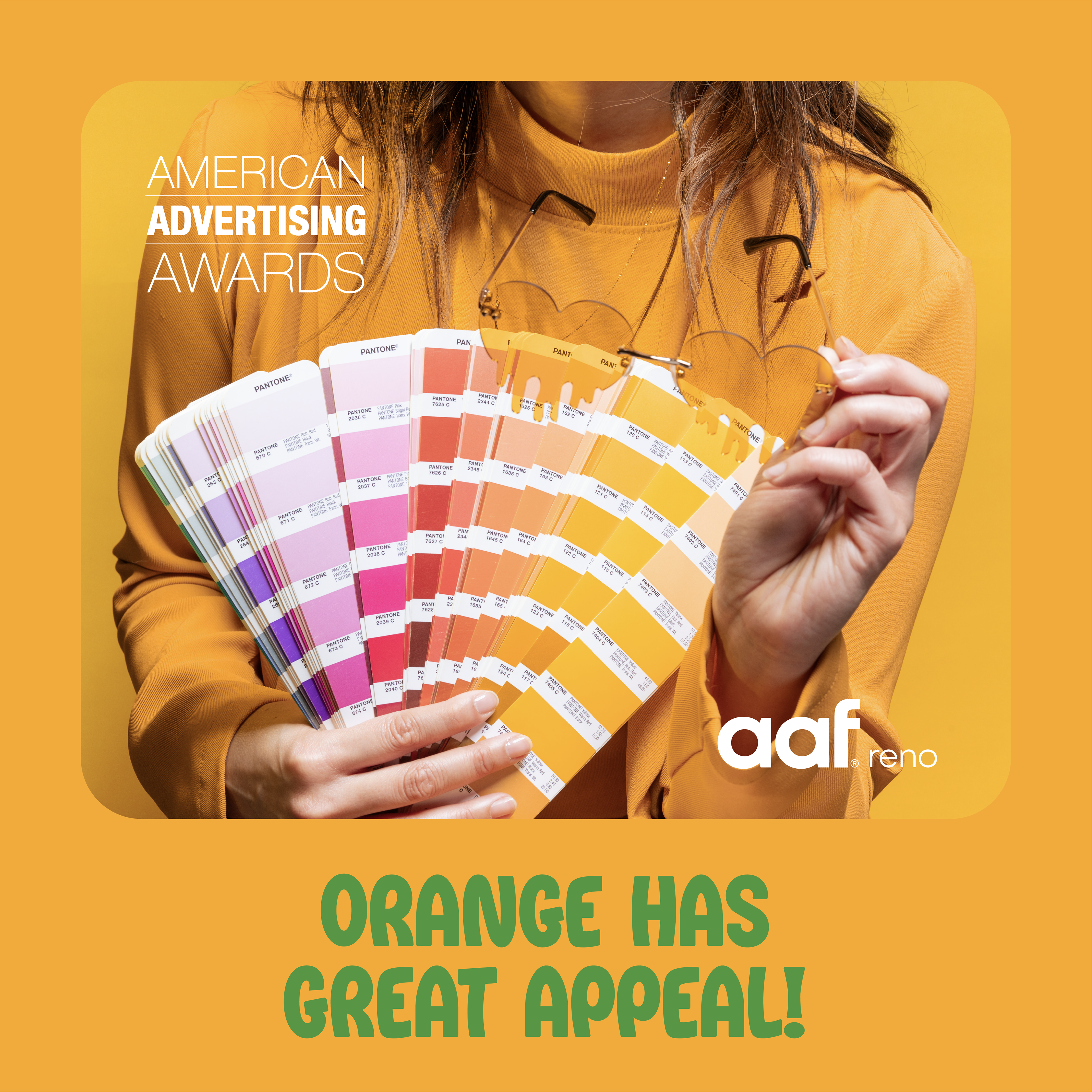
aaf Reno AAA Collateral & Identity
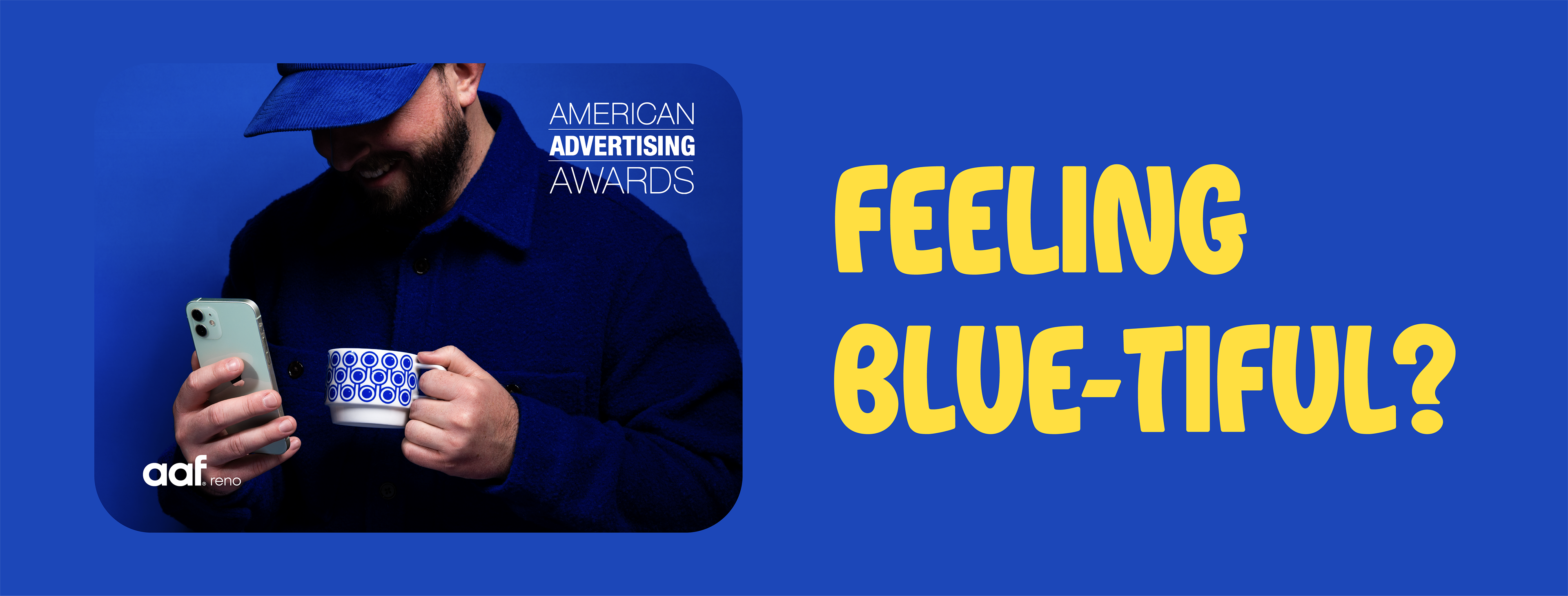
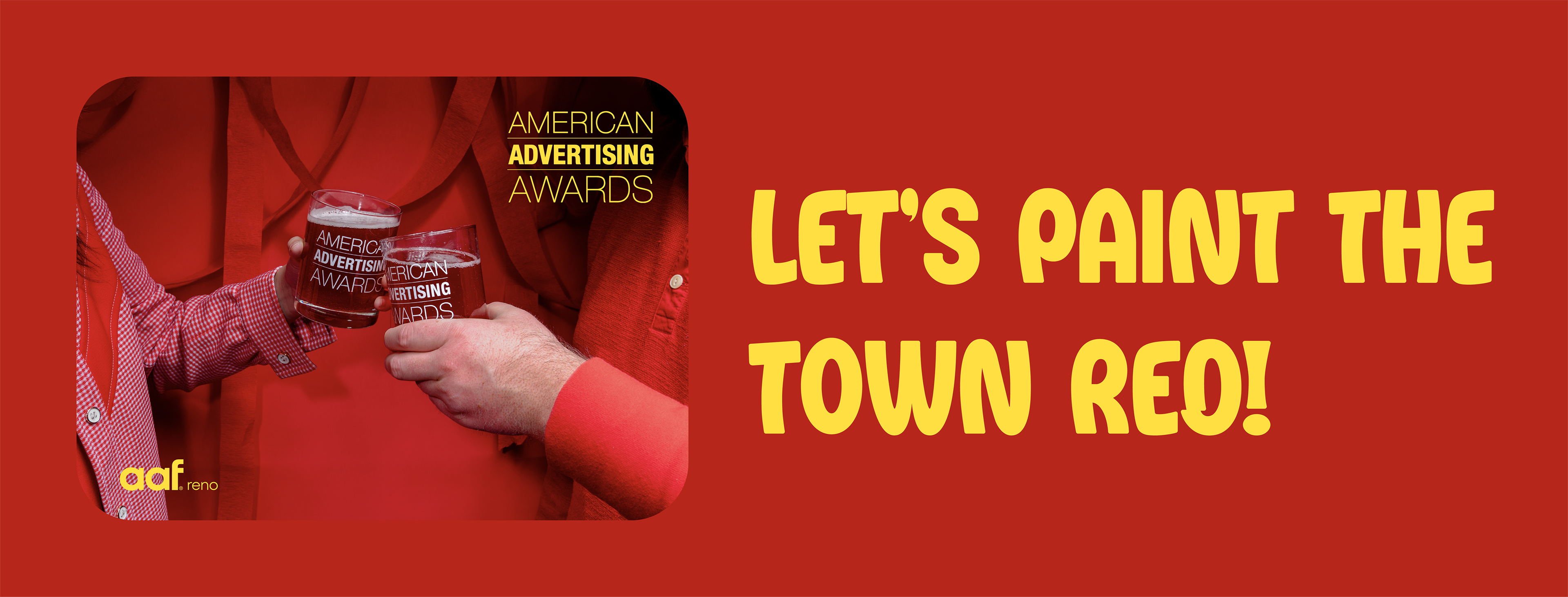
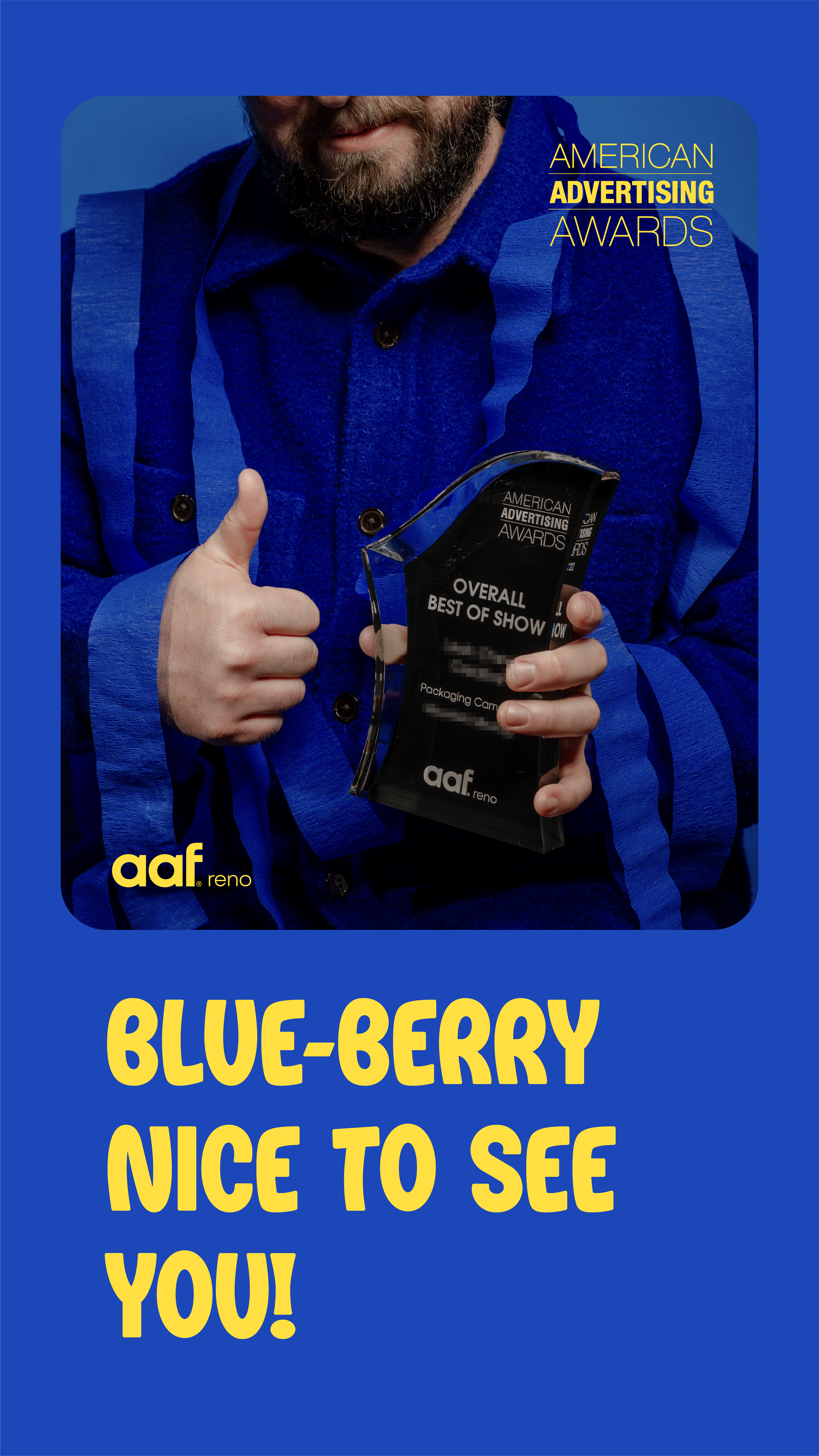
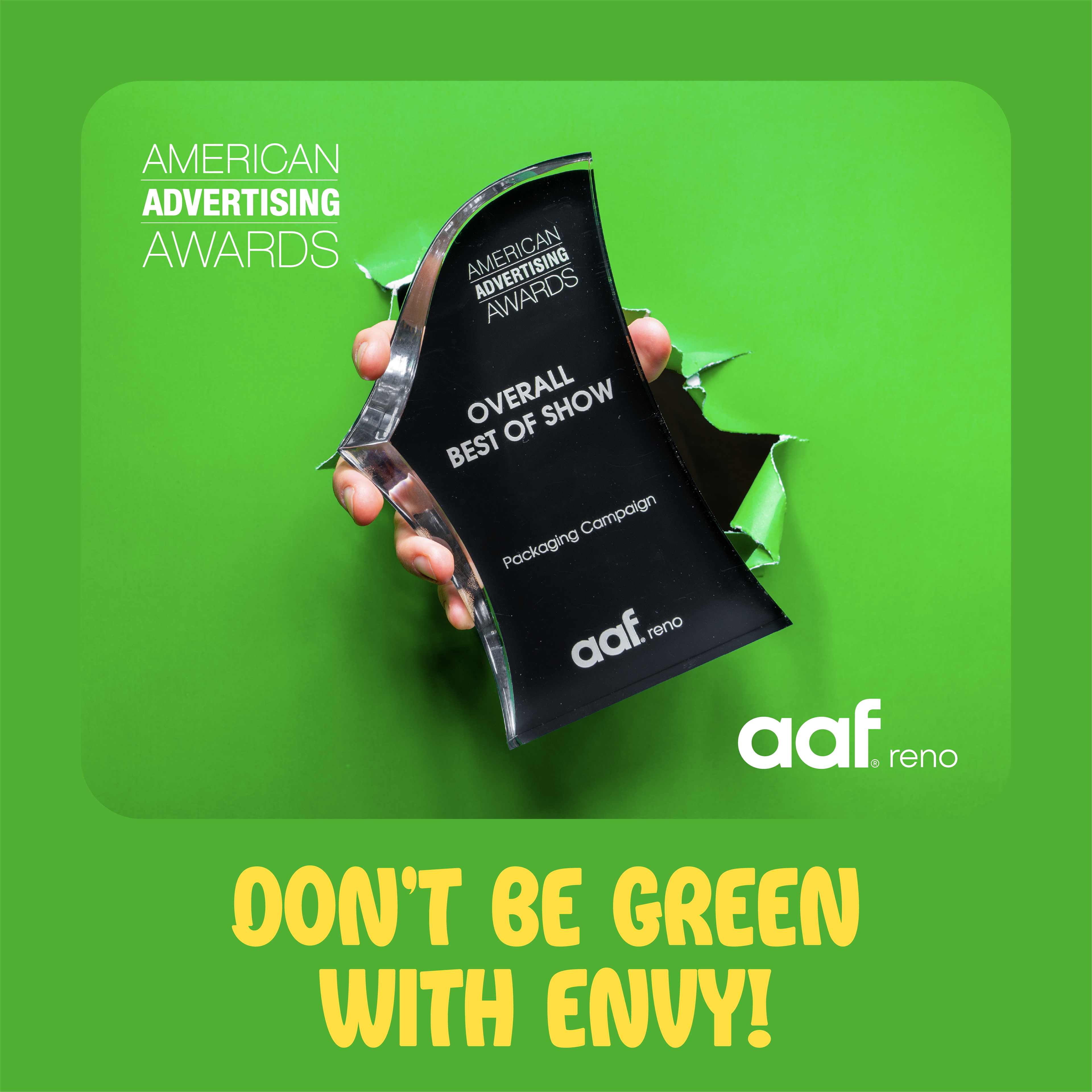
Identity created for local advertising club, aaf Reno's American Advertising Event. Social posts, event print collateral and promotional items. Photography and final design assets by me. Overall concept in collaboration.
